Data Visualization
October 2010

Prompt
You have one week to discover something interesting in the We Feel Fine (WFF) database. Use what you have learned about Positive Psychology in Professor Jennifer Aaker's Designing Happiness class in the Stanford Graduate School of Business (GSB).
Methods
Python, Photoshop, Processing
Process
Data visualization is a multi-step process. With only a week to do this project, the team quickly went from experimenting with the WFF data to coding up the Processing animation. Along the way we thought about looking at data like the photos people shared, men's happiness versus women's happiness, and whether levels of happiness were affected by the lunar cycle. Ultimately, we thought it most interesting to see whether the market dip of 2008 had any influence on the percentage of people blogging about happy things – this was a GSB class after all!
STEP 1: Experiment with the We Feel Fine API
I first experimented with the wefeelfine.org API, looking at queries one by one to develop a better understanding of which tags were actually captured. For instance, some posts didn't use gender or have a photo associated with them. Using the WFF website interface (seen below), I quickly learned that the trackable options were quite limited if the team wanted to scale our search to thousands of queries.
STEP 2: Write a Python Script to Query We Feel Fine Database
Due to the sheer magnitude of data available, I worked with Kyle Buza to write a python script to query the database and download relevant data to a folder. Unfortunately, we had to let this script run overnight because the website limits queries to four per minute.
STEP 3: Do Step 2 Again, But Better This Time
Since some days were particularly data-rich, and each request was limited to 1,500 data points, we asked the database to return us male and female data separately. This created some complications, however, because 5-10% of posts had no associated gender, and there was no way to ask for those posts separately. We decided to just collect all data points, knowing that some days would have data points we weren't able to collect because they had more than 1,500 data points. We let the script run for another night.
STEP 4: Make Heads or Tails of Our Data
After getting the right data, I took the hundreds of CSV files output by our parser, and imported them into Excel to explore what might be interesting to visualize. What would you have done with the data shown below?

Since our class was about happiness, we decided to focus in on happy and sad feelings, and use neutral feelings as a control. While downloading and reviewing data, we read through a few thousand posts while keeping a list of words that reliably indicated positive, negative or neutral sentiments. We then cross-referenced suitable tags against those on the API to validate our findings and ensure that we did not miss any obvious words.
We plotted the positive, negative, and neutral feelings with absolute number of posts and divided by gender (see below). Good luck making heads and tails of it in this form.
Next we graphed the same data by percentages. There were a few dates where something was wrong with the data and that needed to be cleaned up by hand. (You see the huge yellow and gray spikes? Yeah, those.) Otherwise, the data was starting to make more sense.
STEP 5: Parse With Python
Excel starts to fail after more than 36,000 rows of data. Since our queries generated more than 50,000 rows of data, we wrote another python script to sort the data before saving it as a .csv that we could manipulate more easily in Excel. Essentially, we parsed each day's file, counting the number of positive, neutral and negative feelings. The script then returned the total count for each category along with a sample sentence from each post as a sanity check.
After I played around with the data, the team settled on parsing the data by ignoring gender and only separating by date into happy (e.g. loved), sad (e.g. horrible), and neutral comments (e.g. consistent). Dividing feelings into categories was determined by manually reading through hundreds of sample data; some data did not fall into either of the three categories and were not counted for this visualization.
Just for kicks we made a word cloud of the frequency of these words during 2008:

Alright, now back to work. This is what one line from the final output spreadsheet looks like:
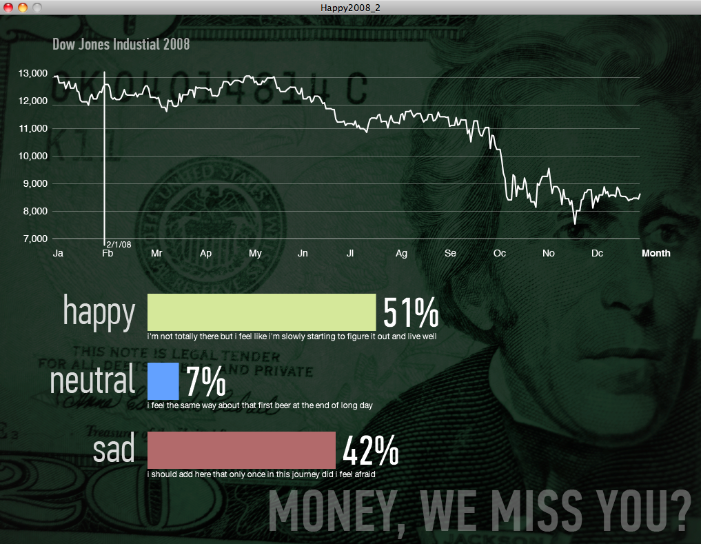
| Date | Percent Happy | Percent Neutral | Percent Sad | Sample Happy Comment | Neutral Comment | Sad Comment |
| 2/1/08 | 0.51 | 0.07 | 0.42 | i'm not totally there but i feel like i'm slowly starting to figure it out and live well | i feel the same way about that first beer at the end of long day | i should add here that only once in this journey did i feel afraid |
STEP 6: Adding Dow Closing values
We added the Dow closing values to the spreadsheet using VLookup to map the values to the correct days, and kept previous closing values constant through weekends and holidays.
STEP 7: Write Processing Code
Using this data, teammate Eric Grossman coded the visualization in Processing.
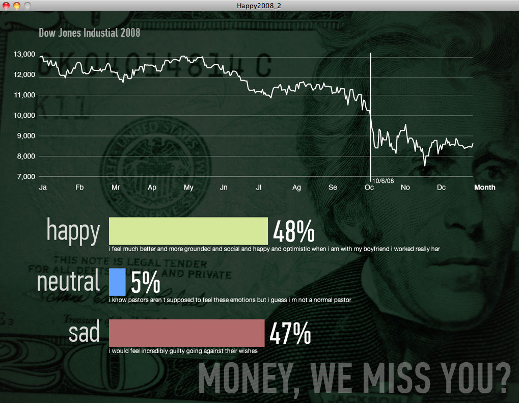
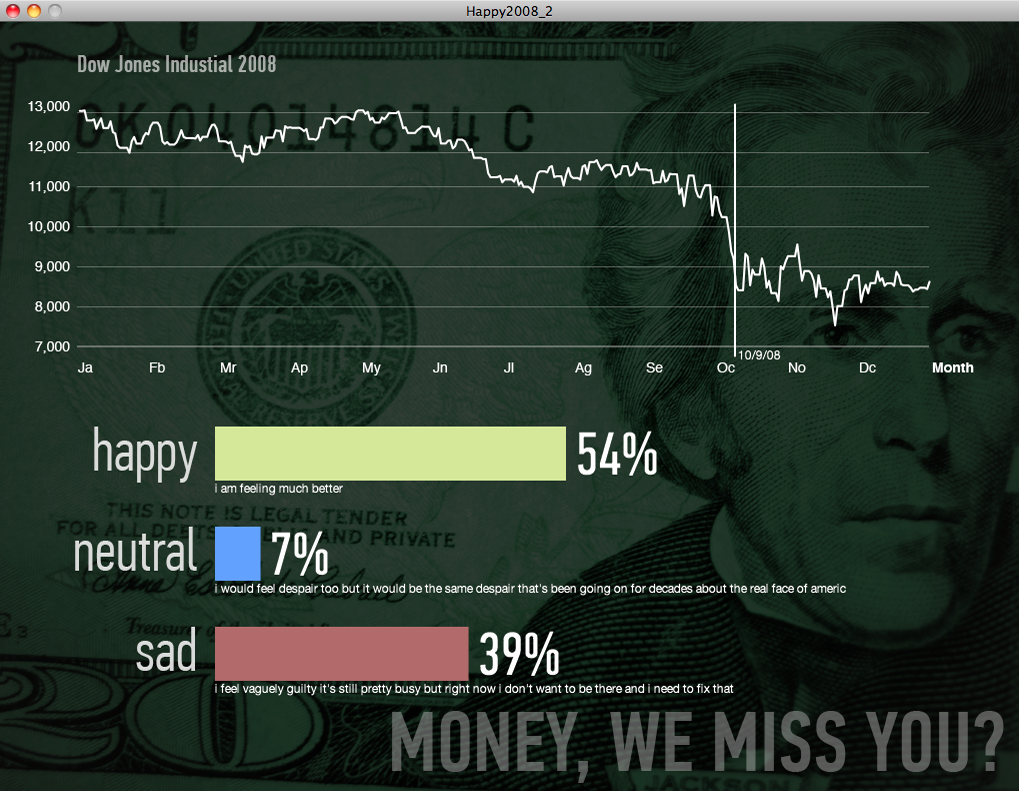
You can see that even as the market fell, happiness percentages stayed constant, fluctuating within a narrow range.
If you’ve got a minute, check out a video of the animation:
STEP 8: Write Report
Teammate Michael Turri put together the final report, including insights like:
Dow Low: 7552 on 11/20/2008
Happiness 52% Unhappiness 42%
Dow High: 13058 on 5/2/2008
Happiness 49% Unhappiness 41%
Happiness Average
51% of blog posts used terms indicative of "happiness"
Unhappiness Average
42% of blog posts used terms indicative of "unhappiness"
Of those days when the Dow closed down:
62% were associated with happier than average blog posts
48% of them were associated with unhappier than average blog posts
Of those days when the Dow closed up:
66% were associated with happier than average blog posts
42% of them were associated with unhappier than average blog posts
Of those days when the market was closed (weekends and holidays:
42% were associated with happier than average blog posts
70% of them were associated with unhappier than average blog posts
Although the data is not sufficient to suggest a correlation between (un)happiness and the stock market, those days when the Dow closed up did appear to be slightly happier than those days when it closed down. The most interesting finding, however, was that happiness was lower and unhappiness was higher on days when the market was closed. Perhaps all of the happy people are busy doing something other than blogging on weekends and holidays?